
Kelly Chiu, Designer
I’ve noticed more banks targeting their advertising to young adults. As a younger UI/UX designer working in financial services, it’s kept me up at night thinking about how I can simplify a complex dive into the financial world which can be daunting for many. How do we include and onboard a broader range of audiences quickly, more easily and at less cost?
Design is key
In financial services, it is the designer’s role to structure and translate complex processes. We live in a digital first world, where the user interface (UI) is key in shaping a user’s experience and interaction, whether that’s navigating through a website, onboarding a new user, or opening a new account for an existing user. Below are some design principals that I follow to improve the sign up and onboarding experience for banking and lending institutions I work with every day at GBST.
1. Make it work ‘well’ in mobile
We carry our mobiles with us everywhere and now, manage our finances from our pockets. Most of our interfaces are responsive, but we need to take into consideration that the human interaction we have on mobile is different to a traditional desktop environment. Desktop has a large surface, with the advantage of being able to hold and spread out more information on a single screen. Mobile on the other hand, is more constrained in size and requires you to ‘reveal as you go’. The same information from desktop should not be presented in the same format on mobile as this would be an overwhelming and messy user experience. The look and feel needs to remain consistent and by prioritising and removing complex features/elements like side menus and switching hierarchy of components, you can create a more enjoyable and simplified mobile experience for users in a cross device set up.
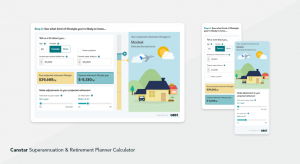
This Superannuation & Retirement Planner Calculator that GBST designed and developed for Canstar is a great example of optimising features like the status bar in mobile to allow a cleaner experience and moving the ‘make adjustments’ panel to below the animated results for better mobile hierarchy.
2. Tell users what to expect
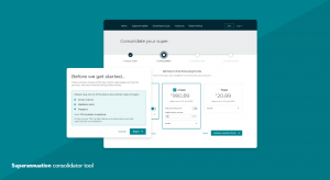
Before the user begins, give them notice as to what’s going to happen. This can be a simple ‘before you get started’ message that contains what is required of the process, the number of steps, time required, and documents to have ready – so nothing breaks the experience halfway through. Add a progress bar that visually indicates where they are in the process. This keeps users more motivated and helps a greater proportion of users reach the end. This translates to a higher conversion rate, that impacts bottom line profits.
The tool that GBST designed to help prospect and existing members combine their super provides useful information to users before they begin and uses a clear progress tracker to indicate the user’s path to completion.
3. Provide help and advice along the way
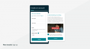
When it comes to the onboarding process, there are several fields to complete. We are often confronted with content we don’t understand and may refer to Google for answers, which means leaving the page we’re on. It’s essential, that form fields come with descriptions about what they mean and the information that is required. It needs to be simplified guidance, hidden for those that don’t need to see it, but clearly available to those that require some help along the way. Adding a tooltip icon that opens to describe what the title means is a perfect example. For users who are first-time investors, this is a wonderful opportunity to educate and improve financial literacy.
When GBST strategises and designs investor onboarding journeys, like the example below, we make sure to use tooltips to help users understand the information required and why it was needed.
4. Have a helping hand available
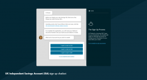
Not everyone is keen on being independent, especially when there’s money involved. Having a chatbot or live chat function that can provide guidance along the way not only increases customer satisfaction but can also reassure the user that there’s help when they need it. Automated chatbots like the one GBST designed to help set up a UK Independent Savings Account (ISA) is a great example of how to help users navigate through the sign-up process smoothly.
5. Get in quickly and out quickly
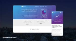
The journey needs to be simplified, quick and minimise interference with the user’s ability to multi-task at the same time. Everything should be completed on the spot in real-time and without the need to leave the process. It should conclude with praise or a reaction that highlights the achievements of the process. This can be a personalised ‘Congratulations Kelly’ or ‘You’re all set’ message along with a simple icon or graphic that shows encouragement. Appreciation will make us feel cared for and reinforces to the user that ‘It was successful because you made it through the process’ and ‘It’s all worth your time’.
When GBST completed the strategy, design and development for Superestate, a digital first superannuation fund, we ensured there was clear messaging that celebrated the user hitting a milestone.
While the financial world we live in can be a complex one, we must focus on making experiences straightforward. With a designer that lives and breathes financial services, best practice design principles and the right underlying technology, banks and lending institutions can attract a broader range of customers and help guide younger users on the right path to gaining confidence in financial literacy and making more informed financial decisions.
GBST’s interactive online tools and calculators are used by more than 100 financial services organisations and millions of their customers in Australia, New Zealand, the UK, the United States, and Canada. The GBST Digital team works with financial services clients worldwide to improve brand reputation, build brand advocacy, and enhance online customer journeys, engagement, and acquisition. GBST’s customer experience experts create bespoke digital solutions for financial institutions from calculators to portals, apps, content management systems, and more.
Posted in: GBST Digital, Wealth Management Administration


